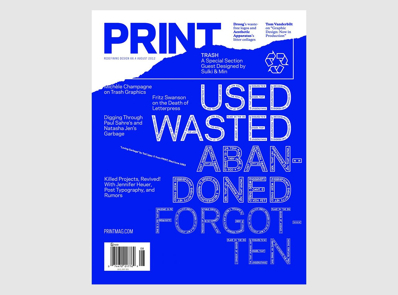
Empty Space
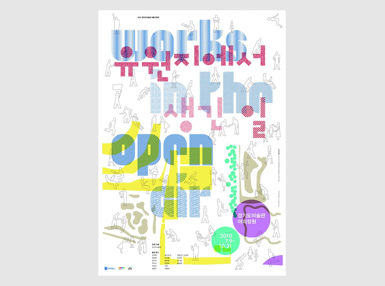
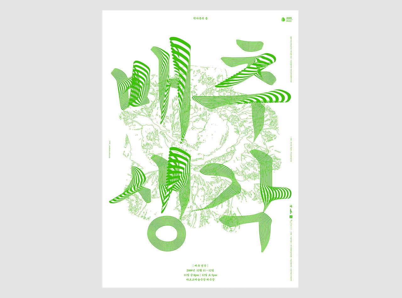
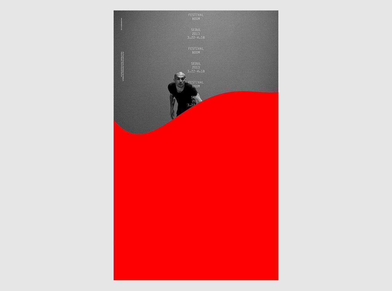
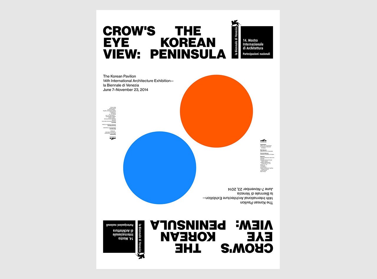
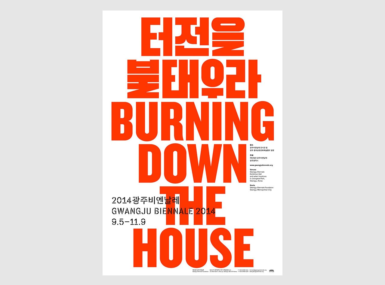
Until recently typical Korean graphic design didn’t really appreciate empty spaces, and it liked to mix things. I suspect people feel a bit uncomfortable with starkness or with highly rational designs. Simple-looking design solutions, however well-considered, would appear “lazy” because of the lack of ornamental elaboration. But a preference for mixing things has produced some of the most interesting works in Korea, such as Choi Jeong Hwa’s mixture of the high and the low, the precious and the vulgar. Min Choi
