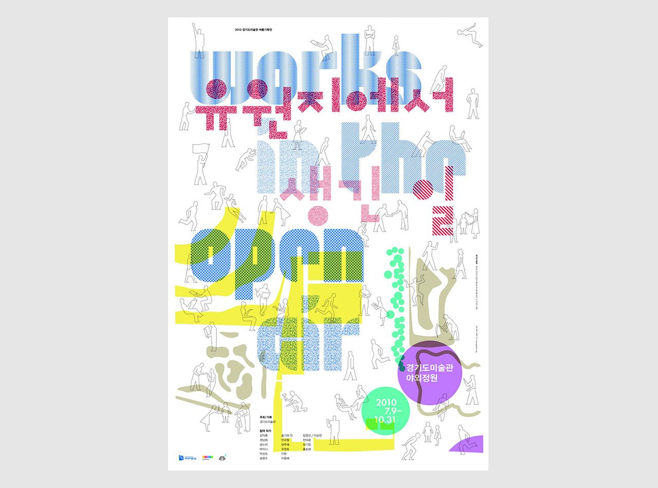
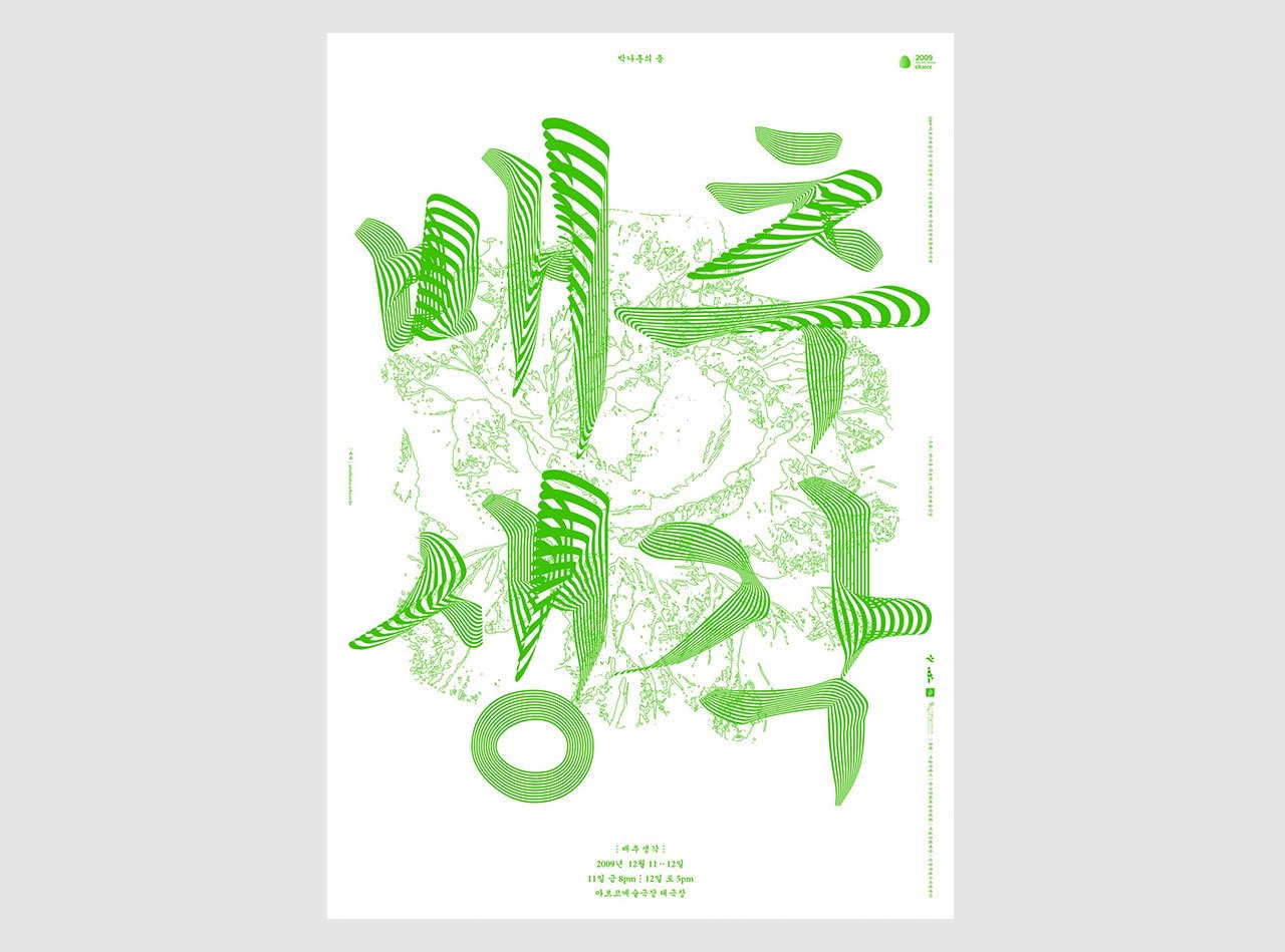
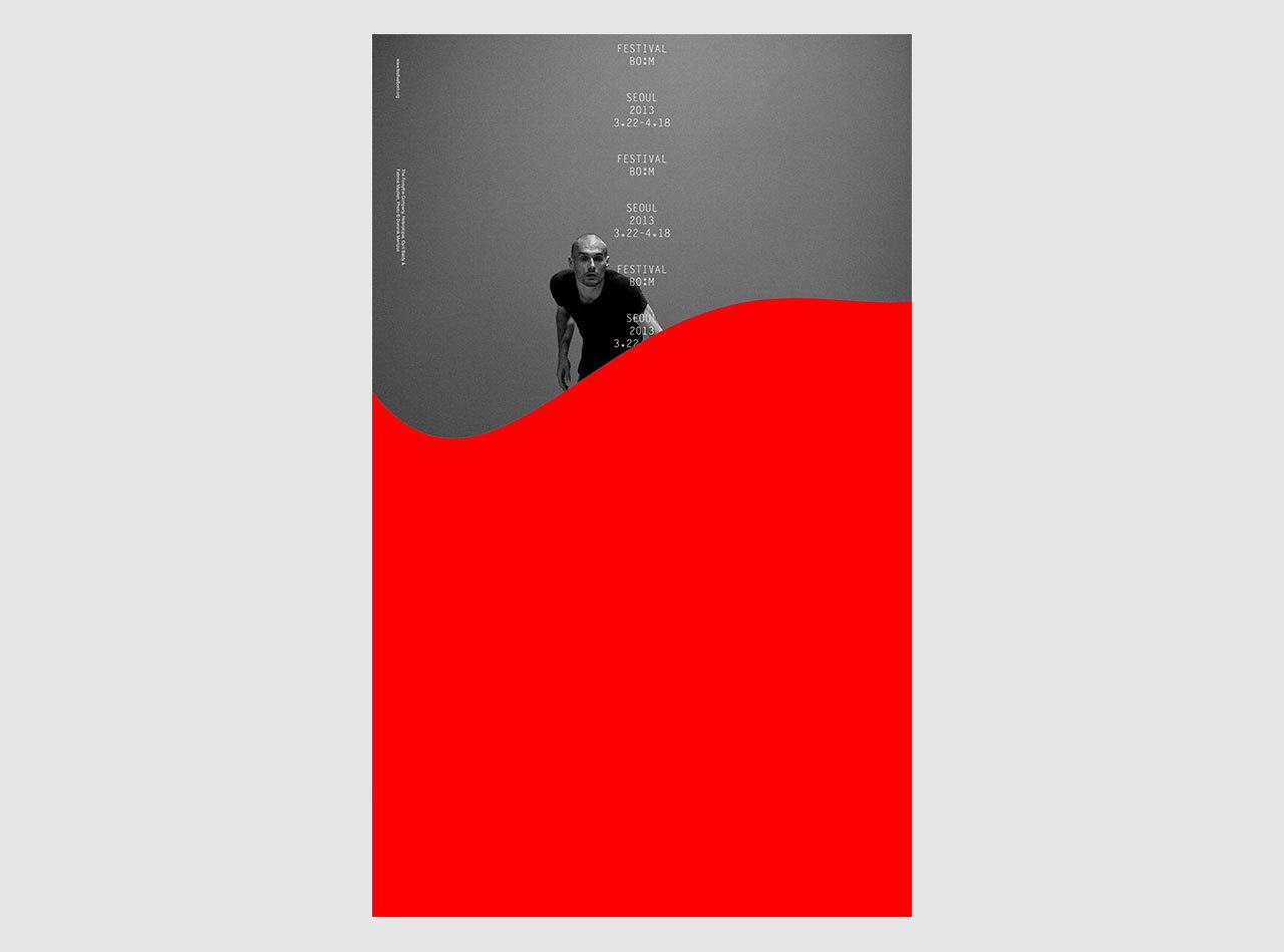
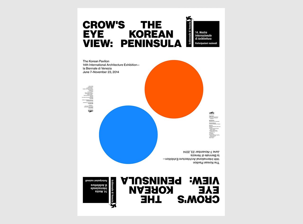
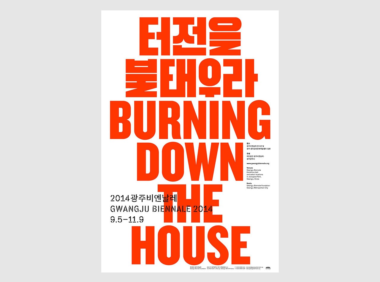
Sulki & Min
Min Choi, South Korea, Studied communication design at Seoul National University, and earned an MFA in graphic design at Yale University. After working as researchers in design at the Jan van Eyck Academie in Maastricht, Netherlands, Min and Sulki Choi founded their own design practice as well as the publishing house Spector Press. Min currently teaches graphic design and typography at the University of Seoul.
www.sulki-min.com
The Interview took place in January 2016. Ingo Offermanns IOmet with Min Choi MCin Seoul, South Korea.
Introducing the cultural context
IOMin, looking for your studio, we wandered through this exciting neighborhood and came across galleries, bars, and concept stories. Is it an inspiring context for you? Or are there other places in Seoul that you prefer?
MCWell, Sulki and I don’t live in the city for many practical reasons. We just work in the city. And we do like this neighborhood—but it’s an exception in Seoul. Changseong-dong is charming, and you can find inspiring art and design spaces like the Book Society here. Seoul in general is rather ugly and, in a lot of places, even repelling, but in their own interesting ways. It’s a city that is constantly rebuilding itself. It’s somehow hard for me to feel a stable connection with the city—but maybe that’s good for me. Maybe this somewhat ironic appreciation of the city’s brutality is what keeps me working.
IOIs Seoul or South Korea in general a good place for graphic designers?
MCSeoul has always been a dynamic place, but it’s recently become more diverse. A lot of inspiring people come here to work and experiment. You have good art spaces and a design scene, which is small but vibrant. Graphic design is not an old discipline in Korea, so you can still feel some kind of pioneering spirit.
However, in Korea almost every designer is underpaid and overworked. The work conditions are probably harsher here than they are, for example, in Europe. This has to do with our economy in part, but also a lack of appreciation for graphic design. Outside the cultural world, we still have to struggle for professional respect.
IOAfter a couple of days in Seoul I have the impression that South Koreans are able to find a good balance between modern life and culture heritage—cliché or truth?
MCWell again, maybe I’m being too critical of my own culture, but in order to have that balance, you would need proper cultural heritage and traditions in the first place. It could be the modernist in me speaking, but I think that anything resembling them in our minds is basically a modern construction. For example, our writing system was invented about 400 to 500 years ago, but it wasn’t widely used until the 20th century. We had to almost reinvent the script to make it a national writing system. The same can be observed in many other parts of our “cultural heritage”.
We like to believe that we have a kind of heritage to cherish—we probably need this idea of tradition for the sake of cultural identity. But honestly, most of the things we know, feel, do, and enjoy are modern inventions.
IOIs this a problem for Korean society?
MCFor me, the lack of a truly cherishable heritage is not a problem. It’s the obsession with the idea of authenticity that becomes problematic. It can become unhealthy when people start to mythologize our culture and identity. Many Korean designers from the 70s and 80s tried this with images, namely with cloud and crane motifs, and by the 90s, Korean typography was linked with a notion of “the true expression of our language”. In my opinion these are not good approaches to the challenges of modern Korean society, which, in essence, are not so different from those in any other societies, Western or Asian.
IOIs there a special Korean approach to graphic design?
MCUntil recently typical Korean graphic design didn’t really appreciate empty spaces, and it liked to mix things. I suspect people feel a bit uncomfortable with starkness or with highly rational designs. Simple-looking design solutions, however well-considered, would appear “lazy” because of the lack of ornamental elaboration. But a preference for mixing things has produced some of the most interesting works in Korea, such as Choi Jeong Hwa’s mixture of the high and the low, the precious and the vulgar.
Introducing the person
IOWhat is the most beautiful thing you’ve ever seen?
MCThat’s a good question. I think the most satisfying experience for me wasn’t something I saw, but something I heard. When I was in middle school, I first heard “Purple Rain” by Prince and the Revolution—I was shocked and overwhelmed. This might be the most beautiful thing that has happened to me.
IOWhat ideas do you find particularly fascinating at the moment?
MCI’m currently reading Franco Moretti’s book Distant Reading. It’s about approaching literature from a distance to discover larger patterns in a greater amount of works, as opposed to the (traditional) close reading, which focuses on a select few works and tries to untangle their intricacies. It’s about finding long-term tendencies and large-scale changes in topics, artifices, genres, or systems. This method can be used to compare ideas cross-culturally, looking at how comparable ideas emerge in different regions and cultures, and how principles from one culture are copied / twisted / merged / enhanced by others.
I’m fascinated by this work, because I think you can apply Moretti’s method to graphic design as well. For example, we can analyze, as Moretti does with his study on “world literature”, how the Western forms of typography are negotiated with Korean contents here—how the incongruity created certain tensions, and what roles ornaments play in lessening the tensions. If we could collect enough data and develop efficient tools for analysis (Moretti relies on sophisticated computational methods and a huge database), then it would be interesting to compare situations in different cultures.
IOYou studied at Yale University and you did research at the Jan van Eyck Academie. Why did you chose these places?
MCIn the 90s, I saw a lot of interesting things coming from the U.S., initially from California (Emigre Graphics) and Michigan (Cranbrook Academy of Art). When I actually started planning to study abroad in the late 90’s, Yale seemed to be a more interesting option because of the European influences there. Some of the best teachers at Yale were from the Netherlands or had a connection with the country’s design culture. A few of them recommended that Sulki and I continue our research at the Jan van Eyck Academie, a highly open and experimental place. I don’t know if we really continued our research per se, but we did manage to take the first steps towards our independent practice.
IOWhat other design or artistic disciplines are important for you?
MCMusic, primarily contemporary pop music. But I’m not a collector and not exactly a fan either—I don’t subscribe to particular genres or artists. I’m more of a flâneur, which is all too easy to be these days. Both Sulki and I also watch a lot of movies, not just art-house films, but more Hollywood blockbusters and American TV shows. We often find inspiration from art exhibitions and performances, but the inspiration can be too direct, or not direct enough to instigate resistance, as is the case with other graphic designers’ work.
Working life
IOCould you describe your typical workday?
MCMy workdays are very different day by day. Some days I teach, other days I meet clients, go to meetings, or take care of our publishing projects. And sometimes I do need to spend my entire day on designing. I guess my ride to my studio or school in the morning and back at night is something that comes closest to a daily routine. I enjoy the state of being alone in the car, focused and on the move all at the same time.
IOWhy do you think clients pick you as a designer?
MCI only work with a handful of clients. They’re friends essentially, so we have a relationship of trust. Beyond this, I think we are quite reliable in terns of meeting requirements or delivering results. And we handle texts with care. I’d like to think that we are an editorial companion for publishers. We also really enjoy compromises, because they can lead us to inspiring detours and some surprising results.
IOHow does your idea finding process work?
MCI usually get my best ideas while doing something else, like driving, changing diapers, or cleaning the house. Though, I really believe that the solution lies in the problem. Reading the assignment closely generates the first good ideas. This may sound cliché to Dutch or German designers, but it has a different implication here, because not many Korean clients are familiar with well-stated briefs. Even government officials, who in most settings would produce very formal briefs, often don’t really believe in them. In Korea briefs tend to be an open starting point. Actual insights might instead be gained while talking to each other on the phone or over dinner. But we prefer a more distant, formal way of communication, so we sometimes interpret briefs very literally, despite knowing that it can lead to misunderstandings. I think it’s OK to start from a misunderstanding.
IOWhat are the most enthusiastic and the most annoying moments in the design process for you?
MCI really like the production process, when the rough material is shaping itself into something beautiful. Also, typesetting is very rewarding for me.
Misprints and incorrect binding are irritating, but at the end of the day, part of the game. Doing presentations can be annoying, especially in front of bureaucrats or politicians, because you have to spend a lot of time translating your thoughts into a language that you don’t like.
IOWho do you get your feedback from?
MCAs a graphic designer, you don’t really get many formal or measurable feedbacks. You deliver the design, and it gets produced when the client likes it. And that’s it most of the time.
Sulki is my most important critic—that’s why we work together. But the design studio downstairs (Workroom) and the people around this neighborhood sometimes also offer feedback. This happens naturally because we get together quite often.
Attitude
IOWho do you design for, for connoisseurs or for everyone?
MCHonestly, for connoisseurs. Just look at the books we design. Most of them have a print run of about 1,500 copies. In the end maybe a 1,000 copies are sold and half of them are actually read—that’s a very small group. I think you need to know a little about graphic design to really appreciate our work. Not that others are repelled by our design, but the effort that we put into our work will probably be noticed by a more knowledgeable public.
But you are ultimately always designing for a peer group; this automatically excludes others, even if you are supposed to design for a broader audience.
IOWhat are the qualities of a good graphic designer in your opinion?
MCTo be critical, to be inventive, and to be communicative. When I teach, my emphasis is placed on general design intelligence. I also make students aware of the nuances of typography for example, because these are the tools they might work with, but I make them even more aware of the need to develop an attitude of looking at problems from uncommon perspectives.
IOWhat are the key guiding concepts for your work?
MCWe sometimes state: Clarifying is our business and obscuring is our pleasure. With any given project, you have a mixture of clarity and obscurity—the clarity of principles as opposed to the obscurity of meaning, or the other way around. And we always try to find a risky and inspiring balance, because with this tension you create attention to the content.
IOCan graphic design change society?
MCI think that the question itself is problematic, because it implies that graphic design is not a part of society. The question doesn’t acknowledge that graphic design is already a part of society, and any changes within graphic design could be a change in society too. If you think of social change only as ecological or political awareness campaigns, you are missing the point. Small changes in newspaper typeface, for example, can reflect social dynamics—this is social interaction.