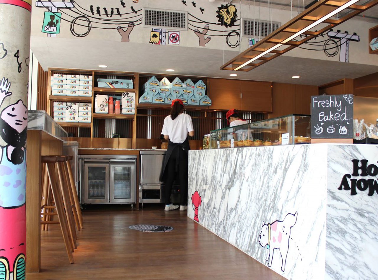
 year: 2015
category: identity
dimensions: various
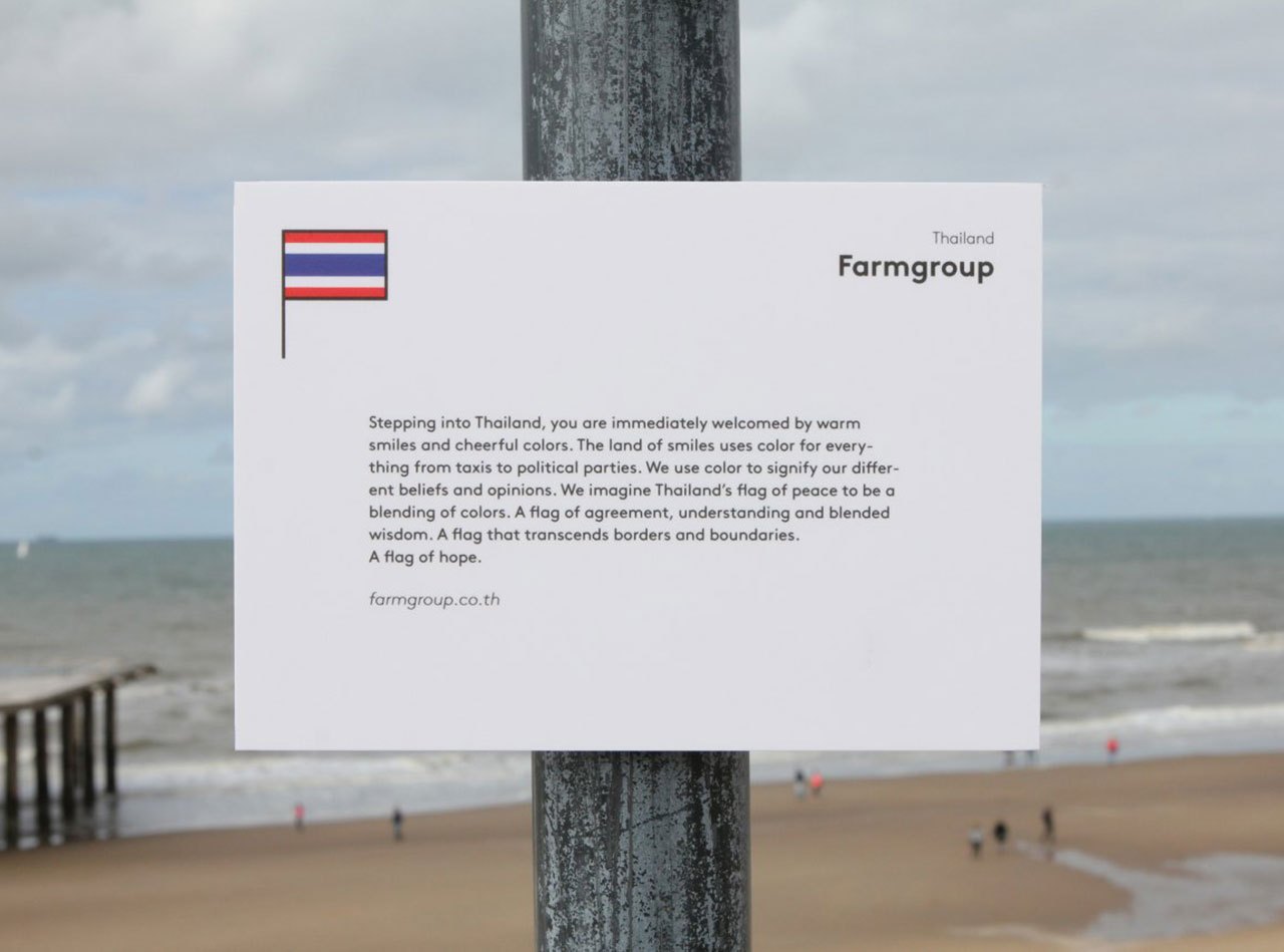
client: Association of Siamese Architect
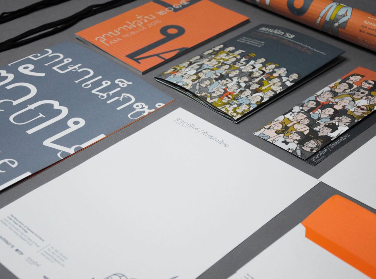
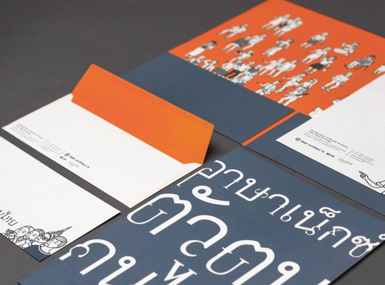
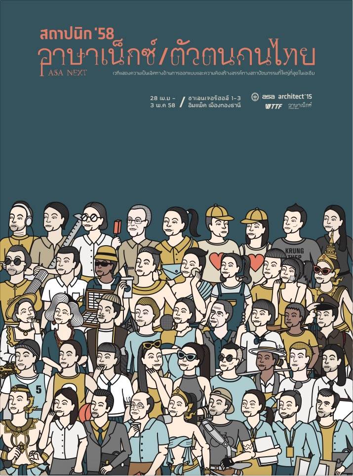
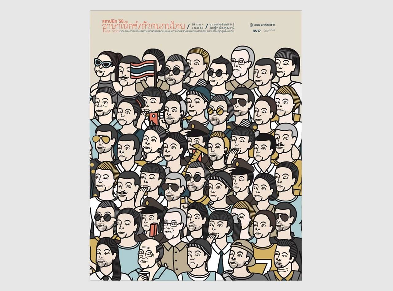
This DIN A2-format poster announces an event dedicated to architecture and design. It is from a series designed by Farmcoup for ASA Architects.
The base colour is orange. The background has fine white horizontal lines running through it. The form and thickness of the lines evokes associations with school books. In two places, the grid of lines is interrupted by mountains—sketched using few lines. One thrusts into the picture from the right-hand edge, and one from the left-hand edge. They overlay the lines. The lines fill approximately 2/3 of the paper, leaving a column free on the right-hand edge.
The composition of the individual symbols is immediately eye-catching: Thai characters unknown to me, combined with more familiar Latin letters. But does this combination of different scripts mean a fusion of two cultures?
The Latin letters are rotated and scaled to complement the Thai symbols. Thus, they lose their meaning as letters through being taken out of context. The individual script characters are superimposed on each other and fitted together to create a picture, representing purely aesthetic building blocks that form a fragile architecture of typographic fragments. The rounded forms in the Thai letters are reminiscent of door or window arches, whereas the Latin “i”s look like small pillars—one recognises a house.
With their rounded forms, the even thickness of their lines, and their geometry, the Thai characters remind me of early Futura design sketches (1927) by Paul Renner. Clear, simple, and elegant, this script type offers ready readability, inviting a playful deployment such as (in what was an audacious move at the time) placing it diagonally or crisscrossing the paper.
Six male figures can be seen scattered amid this “letter architecture”. With their vertical arrangement, they also resemble characters of script. Every figure seemed to be based upon the same drawing; their bodies look immobile and stiff, different only in their appearance and in the position of one arm.
At first glance, these likenesses appeared to resemble icon painting; the figures’ faces have a formulaic expression. According to the website description of this work (farmgruop.co.th), they are based on Thai temple paintings.
The human templates are individualised in fine strokes. They are given three-day beards and trendy hairstyles, and their clothing is in grey, beige and brown tones, suggesting Gap or uniqlo. Their accoutrements—sunglasses and briefcases—are globally-recognised symbols of cool business in the 21st-century, and contrast clearly with the historicising style of the drawing. This would lead to the conclusion that the men represented here are speakers or participants of the ASA forum.
The speakers are listed in a column of text positioned to the right, with the addition of dates and a timetable of events. Both the heading and the subheading use the crossover typography described above—“Thai-Latin” or “Latin-Thai”, depending on one’s perspective. The following programme items are framed in semi-serif script, which looks particularly exotic in this context. The headings and the speakers’ details are in complimentary contrast: blue on orange. The dates and the times of day are distinguished from this by their white colour. The logos of the event organisers and sponsors are reproduced in the footer lines, along with a QR code. Caspar Reuss